This blog sets out the basic issues you need to take on board as an animator, writer or developer looking to explore and create in the new Virtual Reality(VR) spaces. VR is developing fast and the opportunities for storytelling are yet to be fully explored – now is the time to create brand new worlds, and ways of engaging people with a new story space.
So here are some key points to bear in mind when creating your new VR story, based on the blogs by Sean Thompson at WEARVR.
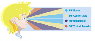
Think in Cones
Traditionally, you will have thought of screenworks from an audience of character’s point of view( POV). In VR the POV is that of the person wearing or using the VR device. These include Cardboard, GearVR, Oculus, Vive, and OSVR etc. often using their mobile phone or tablet as the platform for the VR experience.
In this situation the user’s POV is the only one open to the storyteller, and they see in cones.
©WEARVR
You need to focus their attention on things within 30º comfort zone. Yes, then you can aim for them to look down and up, and turn around, but they will still be looking in that comfort zone.
Enter the Comfort Zone
Given the limitations of the POV, you position the world and the action fin the comfort zone. The user’s natural position should be looking at the horizon — within about 8 degrees of horizontal. If you make them look up it can be particularly tiring.
The key is to avoid foreground action. You can’t change the focal distance — that’s down to the hardware — but you will affect the eyes’ divergence i.e. whether or not the users sees ‘double vision’. A sky or landscape is best, but even the back wall of a large room is normally fine — aim for the centre 15 degree cone having nothing appearing to be nearer to the user than around 4 metres.
Then make sure the scene is not too busy. VR does not have the resolution, frame rates or field of view to allow the sort of high contrast and high motion scenes people can experience in real life.
A final word on comfort – slow movement is best. Think of someone cycling, rather and a jet flying by!
If you follow these basic principles you should avoid doing anything to the user that makes them feel sick, uncomfortable to the point of not being able to continue, or nauseous for an extended period. You can make people startled, or confused, or frightened though, as within the normal bounds of telling a story.
Rules of Storytelling in VR.
“Not all of a virtual world is a stage, everything is first person”. S. Thompson
So inevitably we already have lots of shooter-style VR experiences, but now there are also new and better ways to tell stories, and lead the user into other worlds..
The rules are fairly simple, but might be difficult to take . Text has to be large, within a small area that’s convenient to read from, not moving, not scrolling, and not tracking closely to the user’s head movements. As a result large amounts of text just wont work VR.
Instead we need to look to visual storytelling and some old animation tricks coming to the fore. In the latter camp everything from arrows, high contrast markers, and familiar symbols - think stars circling a head after a knockout blow—work well in VR, In the former it is about using highlights, movement, intriguing pathways, colour changes, and sound cues which will lead the user to follow your story in this new dynamic world.
However, transitions between different locations is difficult and can make the player dizzy. So no hard teleports — ie, no single frame translations or rotations. That goes for everything in the scene, especially other objects in the scene. Sudden movements are seen like flashing lights to the user, and are tiring.
Sometimes you have to move the user from one location to another. After all one of the major storytelling tricks of the trade is a change of location. So good VR design lets users move from one place to another, but you will find times where that movement just gets in the way.
If you’re in this position, try to stick to these rules suggested by Sean Thompson at WEARVR,
- The player should expect the change. Selecting to begin a game, or go to another menu, or having just completed a level will achieve this.
- The transition should be slow. A fade to black then back up seems to be comfortable. A looking glass is more so — where a portal moves to your face, by user action, and the new location engulfs you. A cross-fade or other tween can be made to work well.
- Put the player somewhere similar. At the very least, that means they’re the same way up! The further you push this idea though, the less you need to use point 2. If you’re careful with the scene, you could approach a match cut.
Other Characters in your VR realm
VR can now place another character, including human beings, in the same room as our user. The visual characterisation may be limited but no more than in many games.
Your characters do not have to be fully formed, or follow the same game rules as the user and the other game characters, but they should be able to make use of all the tools a human uses to express themselves each day. They can speak, their face can show emotions, they can move freely, and gesture towards things. Crucially, you need to be able to show them appearing to react . This could be done via scripting text, but the more visual it is the better. Expect your users to engage with other anthropomorphic beings at eye-level.
The Adventure is just Beginning.
Falling from a great height is a right of passage in VR but it is not the only one . Being caught by surprise from behind; glimpsing something – not sure what it is; being trapped in a small space; these are all the hallmarks of horror and thrillers which translate as well into the VR space. Equally, the big emotions from feeling vulnerable in a strange space, lonely, filled with wonder, and surprised by new things, or being challenged to take a leap in the dark can all be part of the VR dramatic world.
For examples of VR go to the WEARVR website
You can read all of Sean Thompson’s blogs on designing and story telling in VR HERE


